How to Create Professional Designs with Canva for Free
If you have ever looked at a polished Instagram post, a clean YouTube thumbnail, or a professional-looking business card and thought, "How do people even make this?" you are not alone. The good news is that you do not need to be a designer or buy expensive software. With the right approach, you can create stunning visuals that look like they came from a design studio.
I have used Canva for social media posts, thumbnails, resumes, and simple flyers. Once you get comfortable with the platform, it feels less like designing and more like arranging things nicely. The learning curve is gentle, and the results can be genuinely impressive.
In this guide, I will walk you through exactly how to create Canva professional designs free of charge, covering everything from choosing the right template to exporting your work at the perfect quality. Whether you are a student, small business owner, or content creator, these techniques will elevate your design game significantly.
Why Canva works so well for beginners
Canva has become the go-to tool for people who need professional-looking designs without the complexity of traditional design software. Unlike Photoshop or Illustrator, which require months of learning, Canva lets you produce quality work within minutes of opening the application. Canva's official Design School also offers tutorials for beginners.
The platform offers thousands of free templates, a massive library of stock photos and elements, and an intuitive drag-and-drop interface. This combination makes it possible for anyone to create professional designs that look polished and intentional.
I have tested Canva against several alternatives over the past year, and nothing else comes close in terms of the balance between ease of use and output quality for non-designers. The free plan alone gives you more than enough to create professional designs for almost any purpose.
1. Start with a template
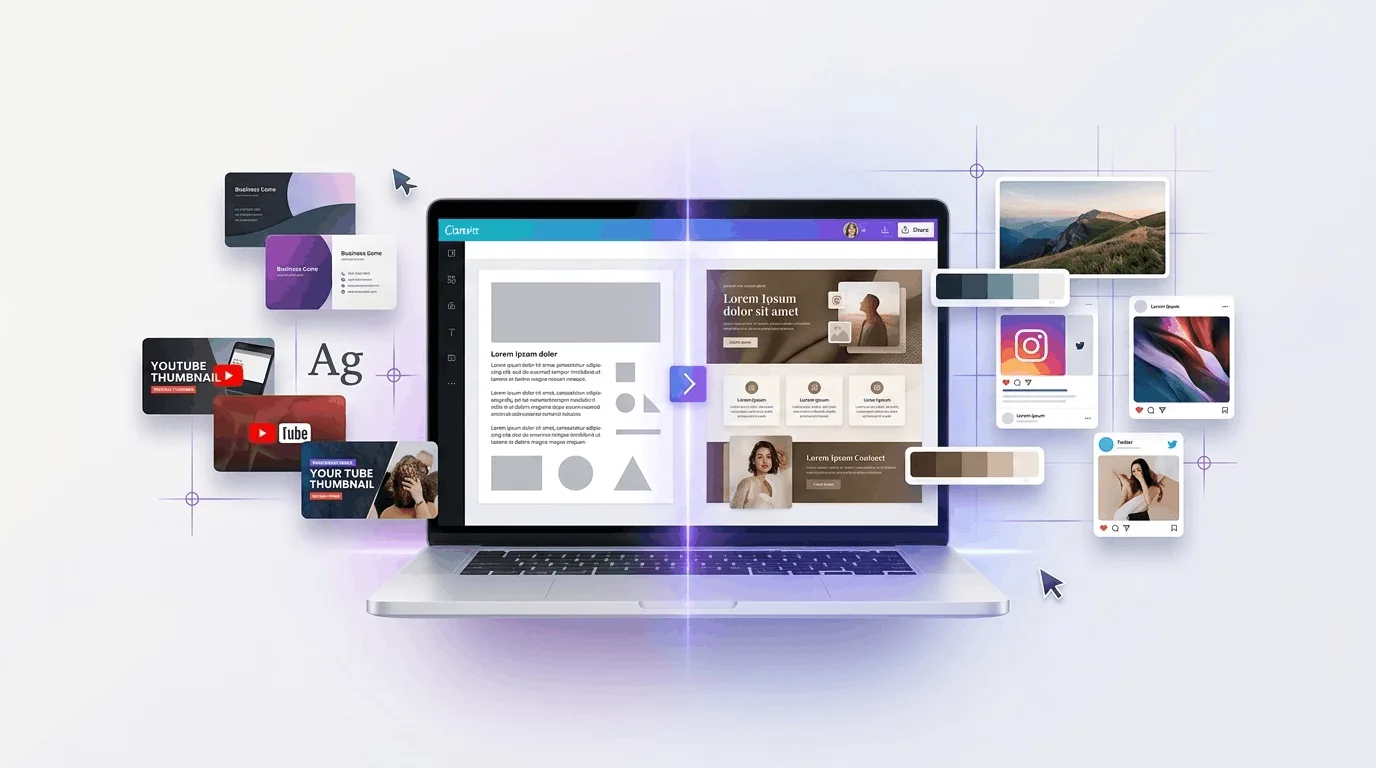
You do not need to start from a blank page. Canva has ready-made templates for Instagram posts, posters, YouTube thumbnails, business cards, and presentations. Search for what you need and then customize it. This is the foundation of creating professional designs — templates give you a professional structure that you can modify to match your brand.
When browsing templates, look for designs that match the mood and style you want. If you are creating something for a corporate LinkedIn post, choose clean and minimal templates. For Instagram, you might prefer something more vibrant and eye-catching. The template you choose sets the tone for your entire design.
Once you select a template, every element is editable. You can change the colors, fonts, images, and layout to make it uniquely yours. I recommend spending a few minutes browsing different options before committing to one. The right template can save you hours of work.
2. Keep things simple
A common mistake is trying to add everything. More text, colors, and icons quickly make a design look messy. Professional designs are defined by what they leave out, not what they include.
Stick to two fonts — one for headings and one for body text
Use two or three colors maximum from a cohesive palette
Leave enough empty space around elements for visual breathing room
Limit the number of visual elements to what is essential
It may feel too plain at first, but simplicity is often what makes a design look professional. The most effective Canva professional designs free follow the "less is more" principle. When in doubt, remove something rather than add something.
I once added twenty different elements to a single Instagram post. It looked like a yard sale. I stripped it down to five elements, and suddenly it looked like something a professional designer created. The lesson stuck with me.
3. Fonts matter more than people think
Fonts can completely change the mood of your design. A serif font feels elegant and traditional. A sans-serif font feels modern and clean. A handwritten font feels personal and casual. Choosing the right fonts is critical for creating designs that communicate the right message.
Use a strong, bold font for titles and headings to grab attention. Keep body text simple and readable — avoid decorative fonts for longer paragraphs. And most importantly, avoid mixing too many font styles in a single design. Two fonts is usually the sweet spot.
Canva categorizes its fonts by style, making it easy to find combinations that work well together. I often use Montserrat for headings and Open Sans for body text. These are both free fonts available in Canva, and they complement each other beautifully for most design types.
4. Pay attention to spacing
Spacing is one of those things nobody notices when it is good, but everyone notices when it is bad. Proper spacing gives your design room to breathe and makes it easier for viewers to process the information. This is perhaps the most underrated aspect of professional design.
Give text room to breathe, keep alignment consistent, and do not push everything into one corner. Canva provides alignment guides that appear when elements are properly aligned — use them. They show you when text blocks, images, and other elements are centered or evenly spaced.
I also recommend using the "Position" tool to precisely adjust spacing between elements. Consistent margins and padding create a sense of order that the human eye perceives as professional, even if the viewer cannot articulate why.
5. Use clear images
Even a good design can fall apart if the image quality is poor. Blurry, pixelated, or poorly lit images make your entire design look amateur. Canva has a free image library with thousands of high-quality stock photos, so there is no excuse for using low-quality visuals.
When creating Canva professional designs free, replace blurry images with crisp, clear alternatives from the library. Choose visuals that support your message and match the overall tone of your design. If you are using your own photos, make sure they are well-lit and in focus before uploading.
Canva also offers basic photo editing tools within the platform. You can adjust brightness, contrast, saturation, and apply filters to improve the look of your images. These small adjustments can make the difference between a design that looks homemade and one that looks professionally crafted. If you create designs for marketing, our guide to AI tools for social media posts can help with the content around them.
6. Stick to a color theme
Pick a small color palette and stay with it. Black and white with one accent color is often enough. Canva also suggests palettes when you need help choosing colors that work together harmoniously.
Color consistency across your designs creates a cohesive brand identity. If you are creating content for a business or personal brand, choose two to three primary colors and use them consistently. This makes your designs instantly recognizable and professional-looking.
Canva's color palette generator is a helpful tool for this. Upload a photo or enter a hex code, and it will suggest complementary colors. I use this feature regularly when creating designs for different projects. It takes the guesswork out of color selection.
7. Use alignment tools
Canva provides alignment guides for a reason. Use them to center elements, line things up evenly, and keep the page balanced. Misaligned elements are one of the quickest ways to make a design look unprofessional.
When you drag an element, pink lines appear to show you when it is aligned with other elements on the canvas. Pay attention to these guides. They help you create clean, organized layouts without needing any design training. Mastering alignment is essential for producing professional results consistently.
Canva also offers grid views and rulers that you can enable from the File menu. These tools help you plan your layout before placing elements, which saves time and produces more polished results.
8. Do not overdo effects
Shadows, glows, and outlines can work in moderation. Too many effects make a design messy. A simple approach usually looks more professional. I see many beginners adding drop shadows, text outlines, and gradient overlays to every element. The result is visually overwhelming and unprofessional.
When creating professional designs, follow this rule: if you are not sure whether an effect improves the design, it probably does not. Remove it and see if the design looks cleaner without it. In most cases, it will.
One subtle shadow on a key element can add depth. Five shadows on five different elements creates visual chaos. Less is almost always more when it comes to design effects.
9. Export properly
Choosing the right format ensures your design looks its best wherever it is used:
PNG for high-quality images and graphics with text — this preserves sharpness
JPG for smaller file sizes when you do not need transparency
PDF for printing documents like resumes, business cards, and presentations
SVG for logos and icons that need to scale without losing quality
The export format matters as much as the design itself. A beautiful design exported at low quality will look terrible in print or on a high-resolution screen. When creating professional designs, always preview your export before sharing or printing.
Canva also lets you adjust the quality and size of your export. For social media, the default settings are usually fine. For print materials, select the highest quality option available.
Building a consistent design system
Once you have created a few designs you like, save your color palette, fonts, and logo as a brand kit. Canva Pro offers this feature, but you can manually track your brand elements on the free plan as well. Consistency is what separates amateur designs from professional ones.
When every design uses the same colors, fonts, and style guidelines, your content becomes instantly recognizable. This is particularly important for businesses and content creators who want to build a strong visual identity using free Canva techniques.
Frequently Asked Questions
Do I need Canva Pro to create professional designs?
No. The free version of Canva provides thousands of templates, millions of stock photos, and all the essential design tools you need to create professional-quality designs. Canva Pro adds convenience features like brand kits, background removal, and premium templates, but the free plan is more than sufficient for most people learning to create professional designs of charge. Compare current plans on Canva's official pricing page.
Can I use Canva designs commercially?
Yes, you can use Canva designs commercially for marketing materials, product listings, business communications, and more. However, if you use stock photos or elements from Canva's library, make sure you comply with their licensing terms. Most free elements can be used commercially, but some premium elements require a Pro subscription. Always check the license before using a design commercially. Always check Canva's content license agreement before using a design commercially.